


The short answer: Modern websites rely on a clear design with plenty of white space and easy-to-read typography. They are planned for smartphones from the start, use animations purposefully and load images in modern, compressed formats.
What matters is not implementing as many trends as possible, but that visitors quickly find what they are looking for.
Trend or real benefit?
New design trends appear every year. Some disappear quickly, others become standard. For a business website, what matters is therefore not whether something is currently fashionable, but whether it helps your visitors.
Before I adopt a trend in a project, I check four points:
- Does it help visitors find what they’re looking for faster?
- Does the website stay fast?
- Does it work as well on a smartphone as on a computer?
- Does it suit your business and your target group?
The following developments meet these points – when they are used appropriately.
Clear design: less, but more focused
Modern websites look tidy. Large, readable headings, plenty of white space and a few deliberately chosen colours draw attention to what matters. Each page pursues one main goal, for example an enquiry, a call or an appointment booking. The matching button is easy to find.
Typical features of a clear design:
- a clear hierarchy of heading, introduction and details
- content in clear sections or tiles instead of long blocks of text
- one accent colour for important elements such as buttons and links
- real photos instead of interchangeable stock imagery
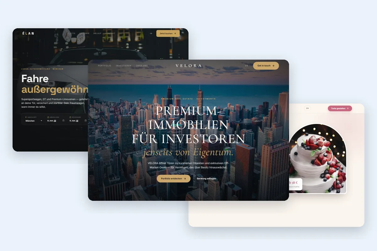
Clear doesn’t mean uniform. The design concept VELORA for a real estate company relies on large images and plenty of space for presenting properties. ÉLAN for a car rental company uses a dark premium design, Zuckerstück for a patisserie a playful, bright design. All three share a clear structure with an unambiguous call to action.
Dark designs
Dark designs look high-end and suit industries that want to convey exclusivity. Sufficient contrast and readable font sizes are important so that text is comfortable to read on a smartphone as well.
Mobile usability first
Many visitors open a website on their smartphone first – often on the go and with little time. That’s why I don’t plan the mobile view as a scaled-down desktop version, but include it from the start.
- Easy-to-reach buttons: Important buttons are large enough to hit reliably with your thumb.
- Direct contact options: Phone number, email address or WhatsApp open with a single tap.
- Readable text: Sufficiently large font and short paragraphs spare visitors from zooming.
- Short forms: Only the fields that are really needed. Optional fields are labelled as such.
- No hidden content: Banners and overlays must not block the page on small screens.
One example is the contact form on this website: apart from agreeing to the privacy policy, only name, email address and your project are required. All other fields are optional.
Animations: fitting rather than everywhere
Movement attracts attention. Used purposefully, it makes processes easier to understand and the website more pleasant to use. Too much of it distracts and can slow the website down.
Useful examples include:
- small feedback when hovering over or tapping buttons
- sections that fade in subtly while scrolling
- animations that explain something, such as a process or a feature
On my references page, the demo websites run across the screen as a band. When you hover over it, the band stops so you can read at your own pace. On the web design page, an example website scrolls slowly inside a laptop and a smartphone.
Some people are sensitive to motion and have enabled the “reduce motion” setting in their operating system. A well-built website takes this into account. Both animations mentioned above also stop when this setting is active.
Fast images: modern and compressed
Images often make up the largest part of a website’s data. If they are uploaded unprocessed, the page loads noticeably slower, especially on mobile networks. Fast images are the result of a few basic technical rules:
- Modern formats: WebP or AVIF are usually much smaller than JPEG or PNG at comparable quality.
- The right size: An image is only delivered as large as it is actually displayed on screen.
- Deferred loading: Images further down the page only load when visitors scroll near them.
- Fixed dimensions: Width and height are set in the code, so the content doesn’t shift while loading.
I apply these rules on this website myself: the images are mostly in WebP format, and images outside the visible area are only loaded when needed.
Among other things, Google assesses user experience with the Core Web Vitals. According to Google (web.dev), these values count as good:
| Metric | What it measures | Good |
|---|---|---|
| LCP | how quickly the largest visible element loads | up to 2.5 s |
| INP | how quickly the page responds to input | up to 200 ms |
| CLS | how much content shifts while loading | up to 0.1 |
The free website check shows you whether your current website has room for improvement in loading speed and images. Among other things, it checks response time, compression and indications of optimised images.
Interactive features with real added value
More and more websites answer questions directly on the page – without a phone call and without waiting. Used properly, such features save time for both sides.
| Feature | Benefit for visitors | Example |
|---|---|---|
| Price calculator | a first cost estimate in a few steps | Staublos, Pandaro, PACKMA'S |
| Configurator | putting together a custom product | Zuckerstück |
| Filterable gallery | finding relevant work faster | Bakar |
| AI chatbot | answers to common questions at any time | Staublos, this website |
| Appointment request | requesting a preferred date directly | AUTOTECH, PhysioVital |
It’s important that every feature has a clear purpose. A calculator doesn’t replace a personal quote, but it gives a first orientation. An AI chatbot should be recognisable as AI and refer to personal contact for questions it can’t answer.
Accessibility and good readability
An accessible website is more pleasant to use for all visitors, not only for people with disabilities. This includes:
- sufficient contrast between text and background
- keyboard operability and visible focus indicators when navigating
- alternative text for meaningful images
- a logical heading structure that screen readers can understand
Since 28 June 2025, the German Accessibility Strengthening Act (BFSG) has applied to certain products and services, for example in e-commerce. Micro-enterprises with fewer than ten employees and an annual turnover of no more than €2 million are exempt for services. The German Federal Accessibility Agency (in German) explains whether your business is affected. If in doubt, have this checked legally.
Conclusion: which trends are worth it?
For most businesses, the developments that save visitors time are the most worthwhile: a clear design, well-thought-out mobile usability, fast images and features with a recognisable benefit. Animations and eye-catching effects are an addition, but not an end in themselves.
You’ll find different designs for various industries in my web design projects and design examples.